DATA MODELING & VISUALIZATION
with POWERBI
NY School Performance Dashboard
This interactive Power BI dashboard provides users with academic data about how individual NYS schools performed on state exams (Regents).I created it by combining several publicly available datasets and modeling the data into a star schema. I used DAX code to create a couple of the attributes.

POWER BI DASHBOARD
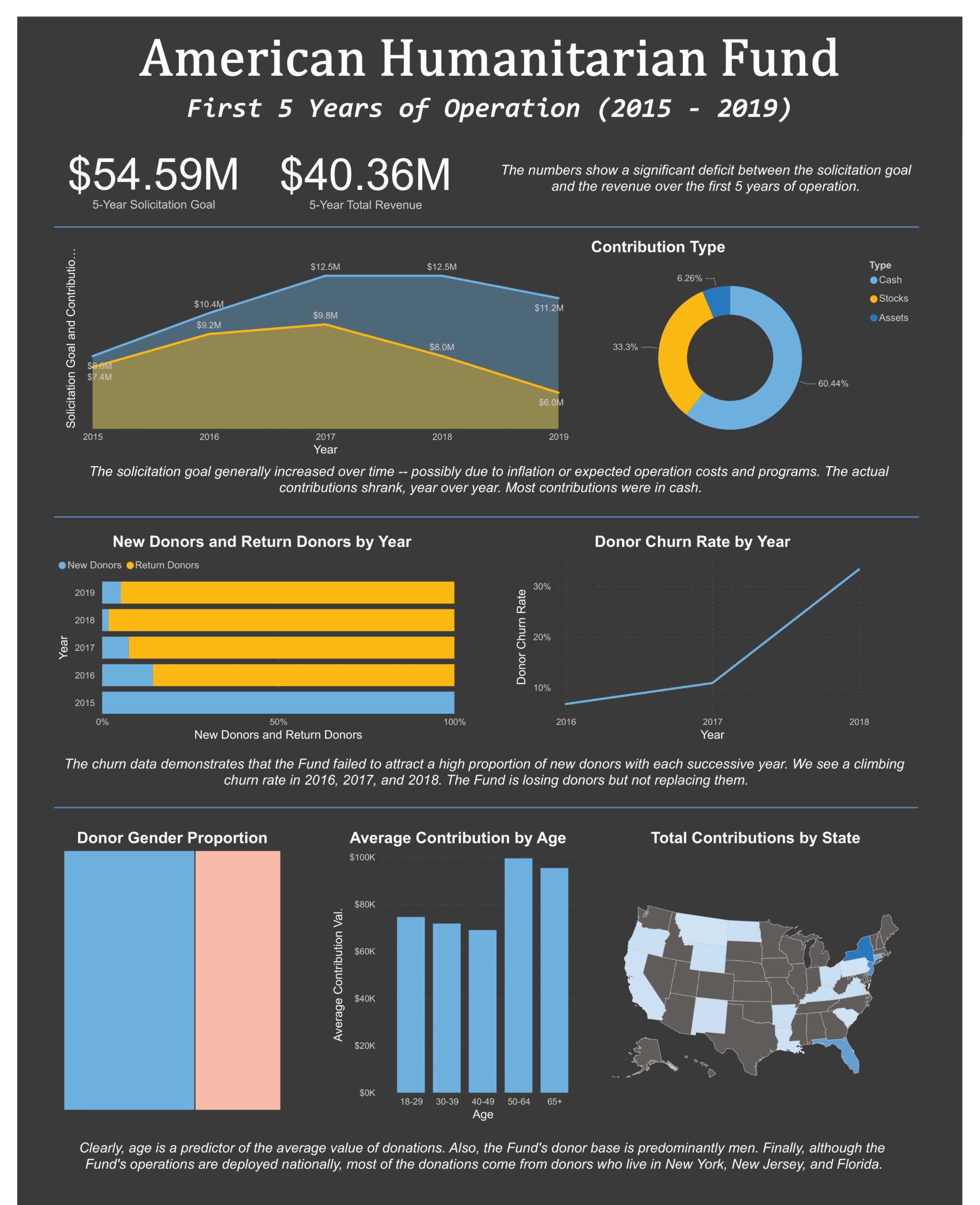
NONPROFIT ORG ANALYSIS
This dashboard is interactive, but it's designed to be easily transmitted as a pdf as well. Underlying data pertains to several key aspects of a nonprofit's viability.

INTERACTIVE EXCEL DASHBOARD
CALL CENTER DATA ANALYSIS
I designed this interactive Excel dashboard with some modern flare. The underlying data represents a company's customer service call center information. Download full file below.
(After downloading, press 'enable contents' -- it takes a couple seconds to settle.)

DATA ANALYSIS + VISUALIZATION
WITH PYTHON
2022 SAT SCORES BY STATE
Visual analysis of states' SAT scores with interactive choropleth graphs. Gleaned data from SAT official reports and analyzed/visualized using Python, Pandas, and Folium.Check out the analysis button below. The full interactive features can be accessed in the Jupyter notebook link.

DATA ENGINEERING + VISUALIZATION WITH PYTHON
NONPROFIT INDUSTRY ANALYSIS
Data for this project came from the BMFF, a public tax database with millions of rows. It's too big for Excel, so I wrote a Python script to query the data and visualize it. I used Canva for the final brochure design. Download and skim at your leisure!

DATA PIPELINE
CSV TO PSQL
I designed this tool and use it often. It allows the user to port a csv file into a psql database, complete with primary and foreign key designations.
NY School Performance Dashboard
You can interact with this dashboard by selecting a schoolname from the list on the bottom-left corner. (If you're using a phone, you may want to zoom in a bit. Tap anywhere else on the dashboard to get rid of the 'filter' widget.)
The dashboard returns 5 different attributes for each school (name, borough, school type, overall percentile standing, overall average) and 3 visualizations (pass to fail ratio, overall average grade trend, average score by subject).
BUILDING THE DASHBOARD
The raw data for this project is available to the public on NY Open Data. The source file contained extensive scoring data for all NY schools that participated in state exams for 2015-2019. However, all the data was in one table. I normed/modeled the data into a seven-table star schema model, as seen below. I created 2 DAX measures to generate the overall average and percentile score metrics.

